Did you know that the map of the world that most of us know is drawn completely unproportionally.
The true sizes of countries are misrepresented.
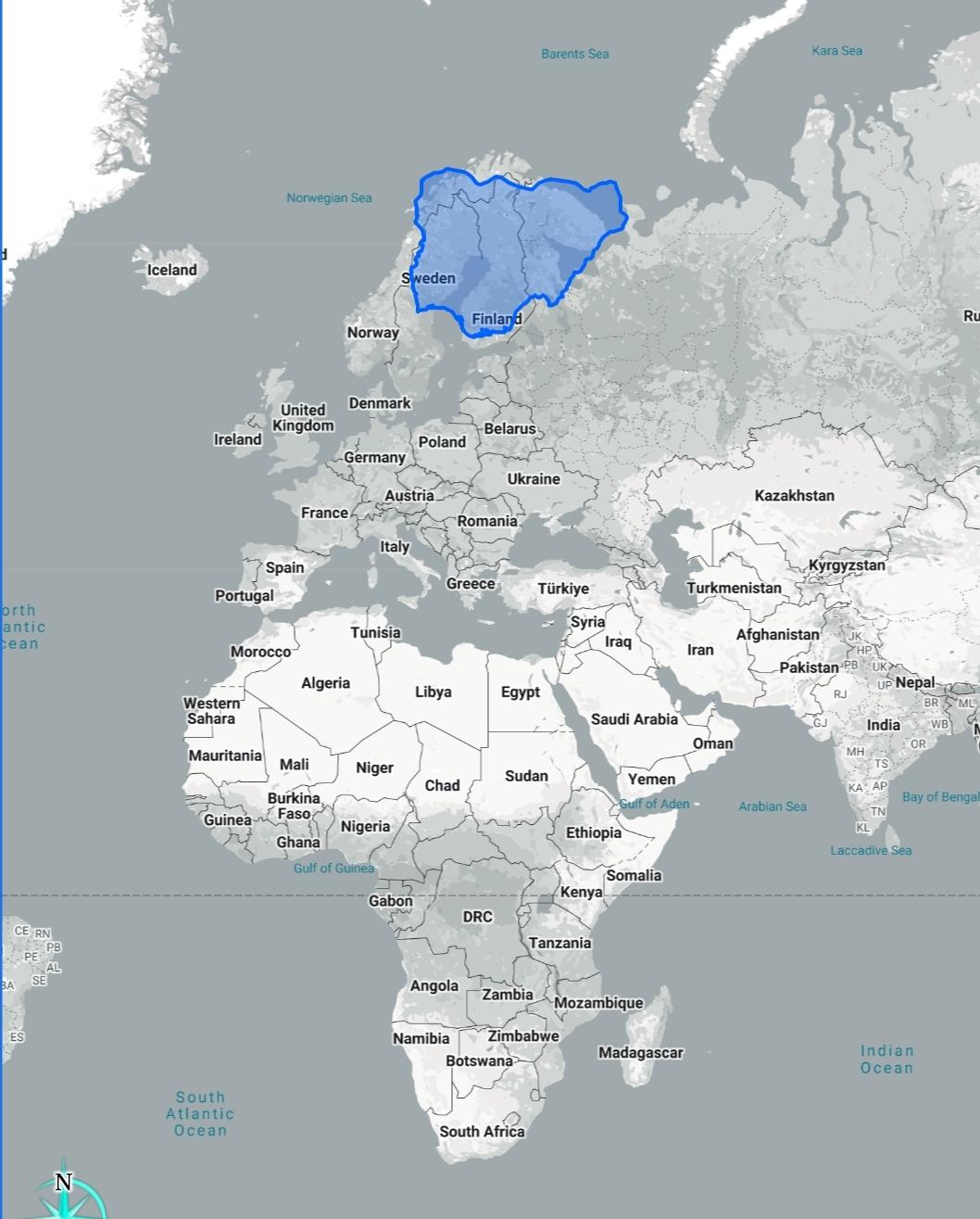
As an example, here is (coloured in blue) the true size of Nigeria overlapped on Northern Europe.
The true sizes of countries are misrepresented.
As an example, here is (coloured in blue) the true size of Nigeria overlapped on Northern Europe.
Did you know that the map of the world that most of us know is drawn completely unproportionally.
The true sizes of countries are misrepresented.
As an example, here is (coloured in blue) the true size of Nigeria overlapped on Northern Europe.


